Socialhyp
June 23, 2026
Imagine spending your budget to drive thousands of visitors to your website, only to watch them leave without buying anything. It feels like throwing money away.
Getting traffic is only half the battle. The other half is what happens when people land on your page.
If your online store or landing page is cluttered, confusing, or slow, visitors will leave. A strategic website design for conversions changes that. It turns your site into a tool that works around the clock to grow your business. Making the right design choices can triple your results.

Many business owners think web design is just about looks. They just want a pretty and user-friendly website. While style matters, great design is really about human behavior.
A conversion is when a visitor completes the desired action you set for them. This could mean:
Every element on your page either helps a user take action or scares them away. High-converting websites do not get lucky. Designers build them to guide the human eye toward a clear goal.
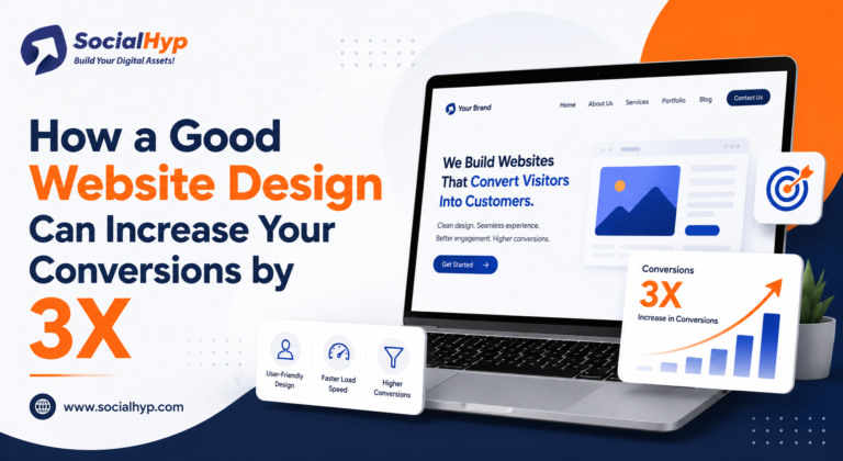
To see a large jump in your sales, you must focus on user experience. Here are five practical UI UX conversion tips that make a major difference.
Visual layout guides the reader's eyes to the first point of attention. The majority of people scanning web pages end up in an "F" or "Z" pattern.
Always place your key message at the top of the page. Highlight your main benefits with large fonts. Besides, provide a lot of blank space around your text so the page remains uncluttered, and the focus is drawn to your main point.
A call to action is the button you want people to click. If visitors cannot find it, your sales will drop.
Use words that command action. When you are making a website you should think about what you want people to do on that page. Of using the words "Submit" on your button it is better to use words like "Get My Free Guide" because it tells people what they will get.
When people get confused, they leave. Keep your main menu short and simple.
Limit your menu to five or six choices. Use plain words like "Services" or "Contact." Avoid strange or artistic titles. It shouldn't be necessary for visitors to search extensively for the information.
Long forms frustrate users. If you want a great lead generation website design, make your forms easy to fill out.
Only ask for what you truly need. Most of the time, just a name and an email address are enough to proceed. Do not demand phone numbers or street addresses unless it is necessary. Show clear error messages right away if someone makes a typo.
More than half of all web traffic comes from phones. Your site must work perfectly on small screens.
Make sure text is easy to read without zooming in. Space your buttons out so people can tap them easily with a thumb. A good design layout adapts to any device automatically.
People only buy from brands they trust. Since online shoppers cannot meet you in person, your design must prove your credibility.
Do not hide customer reviews on a separate page. Put testimonials right next to your products or just below your main buttons. Use real names and customer photos when you can. Seeing that other people had a great experience gives new buyers peace of mind.
If you sell products directly on your site, show secure checkout symbols. If you offer a money-back guarantee, create a small, clean icon for it. These simple visual markers reassure hesitant shoppers.
A beautiful layout fails if the page takes too long to load. Speed impacts your profits.
When a page takes longer than three seconds to load, most users quit. To fix a slow site, compress large images and choose a fast hosting plan. Clean up old code that bogs down the system. Every fraction of a second you save will help keep people on your site.
Also, make sure your site works for everyone. Choose colors that contrast well so that text is really easy to read. Ensure users can navigate your pages using just a keyboard. Good accessibility opens your business to a much larger crowd.
At Social Hyp, we believe web design should do more than look good. It needs to generate revenue. We do not build generic sites. We make sure people can easily find what they want when they visit a website. We do this by making the website look good and work well so people who are just looking around will actually buy something from the website. By doing this we help companies, like brands, make their websites better and sell things.
Visit Socialhyp.com and start your digital transformation today!
Content marketing now focuses on clear, direct answers. AI search tools summarize pages for users. Your text must be simple and accurate so these tools can find your site and credit it as a source.
Search engines reward helpful text, no matter who wrote it. But raw AI text often lacks real depth. If your pages have errors or look like copycat work, your traffic will drop.
The top trends show a demand for first-hand experience. People also want simple layouts and short paragraphs. More teams now use the hybrid model to blend speed with human quality.
Always use a human editor to review your drafts. Check your facts, fix weak sentences, and add links to trusted sites. Replace generic text with real human insights.