
Socialhyp
August 20, 2026
Color Psychology in Branding: How Colors Influence Buying Decisions
It takes humans less than a second to visualize your message. Your customers are seeing your visual presentation before they see your headline or your price tag. Understanding color psychology in branding can help businesses earn the eye of the buyer instantly.
At Social Hyp, we build visual systems that turn casual browsers into loyal buyers. Color is not just a decorative choice. It is a direct communication channel to your target audience.
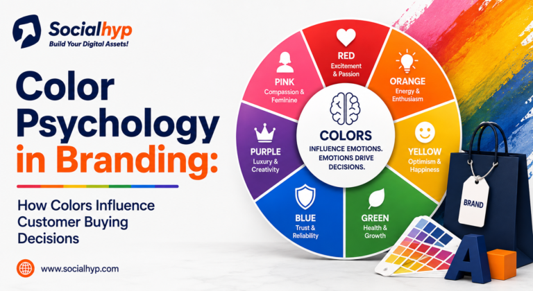
Why Color Psychology in Branding Matters for Sales
When people look at something they might want to buy the color of the thing is what they notice first. A lot of the time this is what they use to decide if they like it or not. This is why companies use colors to make their products stand out from all the things on the shelves.
Colors make people feel things away. For example the color red can make people feel like they have to act. The color red can even make your heart beat a bit faster.
The Power of Brand Colors in Marketing
Picking your brand colors determines the overall tone of your business. Your colors are a subtle way of communicating to customers what to expect from you.
Bright brand colors stand out first and fast on busy retail aisles and social media feeds. Color with darker tint communicates authority, stability, and premium value. When you choose colors for your business, choose colors that match customers' expectations.
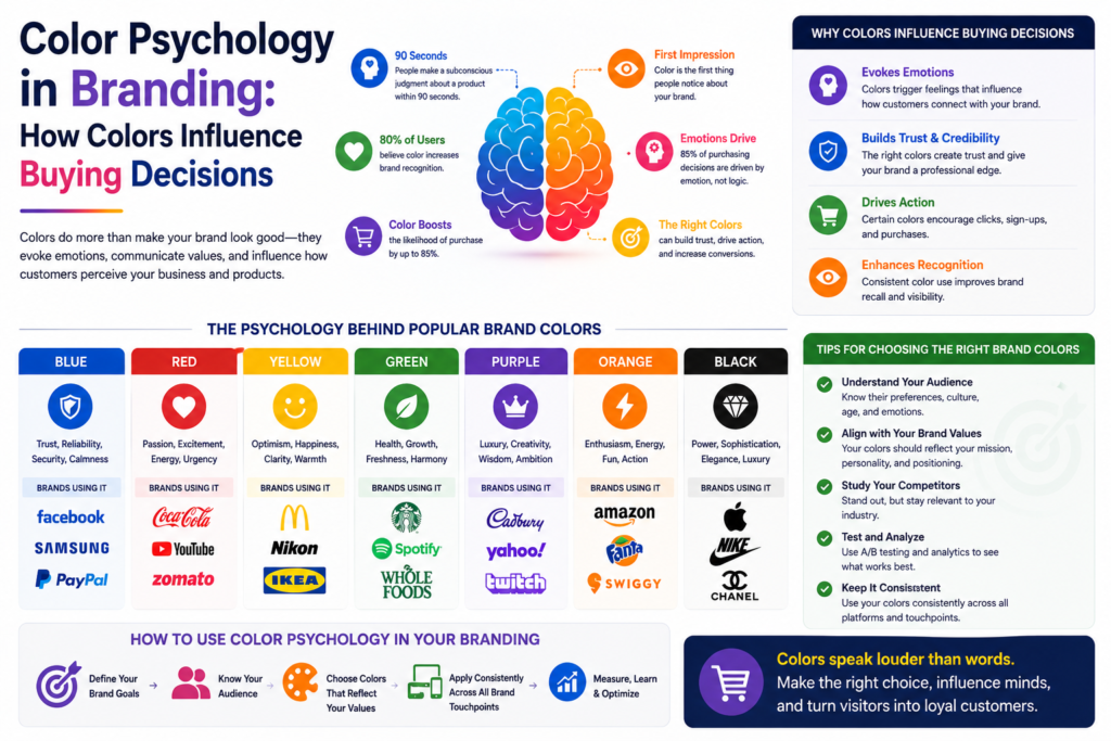
Primary Hue | Emotional Trigger | Common Usage |
Red | Urgency, excitement, energy | Fast food, retail sales, clearance banners |
Blue | Trust, security, logic | Banking, technology, healthcare platforms |
Green | Growth, health, nature | Organic food, finance, environmental tools |
Yellow | Warmth, clarity, optimism | Children products, family dining, caution signs |
Black | Power, luxury, elegance | High-end fashion, luxury vehicles, tech devices |
Using Color Psychology Marketing to Increase Sales
Using color psychology marketing helps you trigger specific buyer actions. Marketers do not select page shades based on personal taste alone. They test how target audiences react to different button shades and banner contrasts.
Top teams use color psychology marketing to boost clicks on action buttons. For instance, changing a purchase button from grey to bright orange often increases store checkouts. Small adjustments in hue can produce big jumps in overall revenue.
Aligning Palette Selection with Your Branding Strategy
A solid branding strategy connects your core goals with visual elements. You cannot pick random shades and expect customers to understand your mission.
Incorporate visual choices into your overall branding strategy early on. If your business focuses on eco-friendly products, neon purple may confuse your target audience. Natural earth tones reinforce your message much better. Alignment across your plan creates instant clarity.
How Palette Choices Shape Customer Perception
Visual details directly influence customer perception during the first three seconds of contact. If a store looks dark and dull, buyers might suspect low product quality.
You can guide customer perception by using calm shades like blue or soft teal. These tones reduce buyer stress and make people feel comfortable spending money. Every shade you present tells a clear story about your quality standards.
Elevating Your Business Through Visual Branding
Strong visual branding creates a clear identity across social feeds and web pages. When your media channels share uniform shades, your company looks organized and reliable.
Keep your visual branding consistent across every print and web channel. Mismatched shades across your website, packaging, and store signs cause confusion. Consistency helps customers spot your products instantly on any platform.
Selecting Effective Logo Colors for Instant Recognition
Picking the right logo colors ensures your mark remains easy to remember over time. Your logo serves as the front door to your business.
Contrast your logo colors against clean space to make your icon pop off the screen. Modern startups match their logo colors to their main product packaging. This creates a clear visual link whenever a shopper sees your product online or in person.
Building a Cohesive Brand Identity Across Channels
A unified brand identity builds long-term consumer trust across all points of contact. When your colors match your brand tone, customers feel confident buying from you.
Practical Steps to Test Your Visual System
Many modern businesses test color psychology in branding to boost conversion rates. Here is how you can review your visual assets step by step:
- Check your current pages: Make sure your button shades stand out clearly against background colors.
- Review competitor choices: Identify the shades your rivals use so you can pick distinct tones.
- Run simple split tests: Test two different button colors on your landing page to see which gets more clicks.
- Gather customer feedback: Ask focus groups what words come to mind when they look at your main palette.
When you study color psychology in branding, you learn why red triggers fast buying choices. Master color psychology in branding to guide how shoppers view your value.
Smart companies rely on color psychology in branding when launching new product lines. Knowing color psychology in branding makes your marketing campaigns much more effective.
How Social Hyp Helps You Pick Winning Palettes
Finding the right visual balance requires testing and market data. The team at Social Hyp uses color psychology in branding to create high-performing assets for growing businesses.
We work with you to choose shades that reflect your core mission while driving sales growth. From initial research to final launch, Social Hyp crafts visual systems that help your business succeed.
 Visit Socialhyp.com and start your digital transformation today!
Frequently Asked Questions (FAQs)
Testing brand colors is a great way to figure out what brand colors work best for the people who buy from you. If you make changes to your main brand colors you can get more people to click on your ads, visit your store and check out the products you sell.
Color psychology marketing is useful for small business owners because it helps them look professional and trustworthy. This way small businesses can compete with companies by making a good impression on people who see their brand colors.
A company should take a look at its branding strategy every three to five years. If you update your brand colors and other visual elements your business will stay up to date. Your existing customers will still recognize your brand.
Yes what customers think about your brand colors can be different in parts of the world. For example the color white means something in Western countries but in some Asian countries it means someone is mourning.
The fastest way to improve your brand colors and overall brand identity is to use the same brand colors on all your platforms. Use the same color codes for your website, social media posts and print ads so your brand looks the same everywhere.